It is darn cold here, and we had more snow falling yesterday, even though spring is technically almost here. (Didn't that groundhog predict an early spring? Ha! This guy needs a talking to!)
I recently visited Michelle Gallant's lovely store, Diamonds and Toads, in St. Thomas, Ont. (She doesn't have a website, but you can visit her on her Facebook page.) Michelle is a retailer for Annie Sloan and she also carries the Artisan Enhancements line. You can read about their products here. I was dying to try their transfer gel!
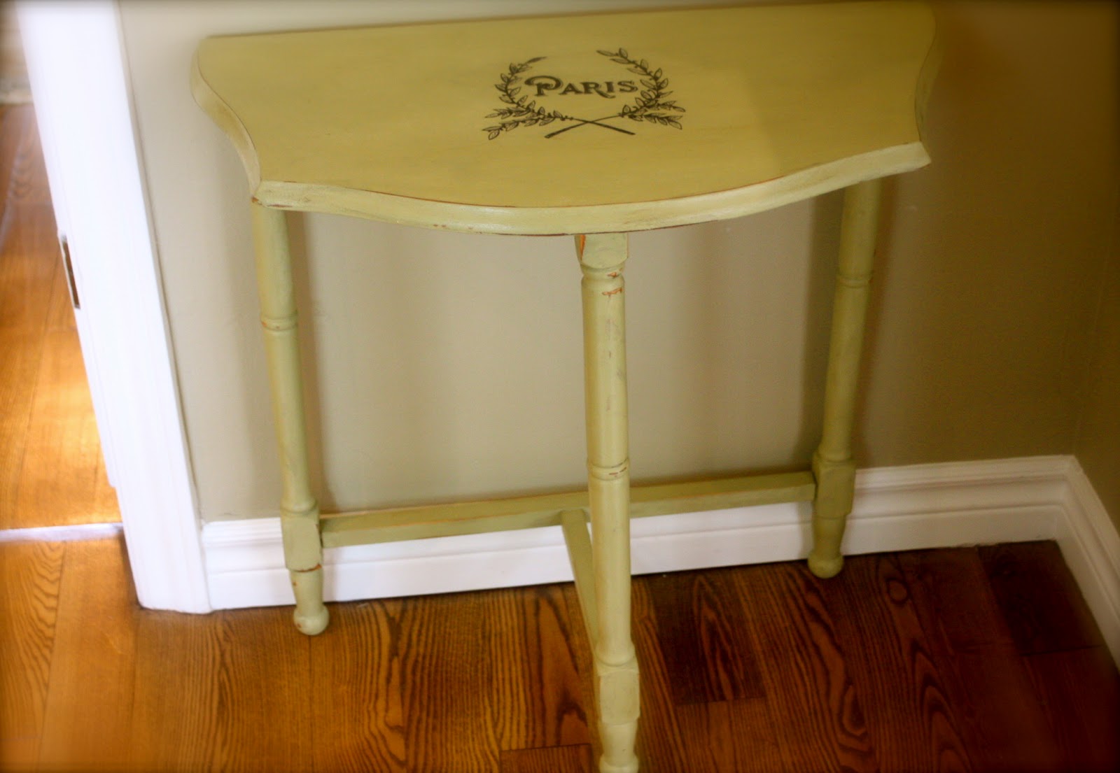
This was my first attempt, an inexpensive candle plate I picked up at the thrift. It was gold and rough looking, but I gave it a makeover with ASCP cream. It looks as good as new now!
 |
| The White Pear Tree |
Then I picked out this lovely graphic from who else, the Graphics Fairy!
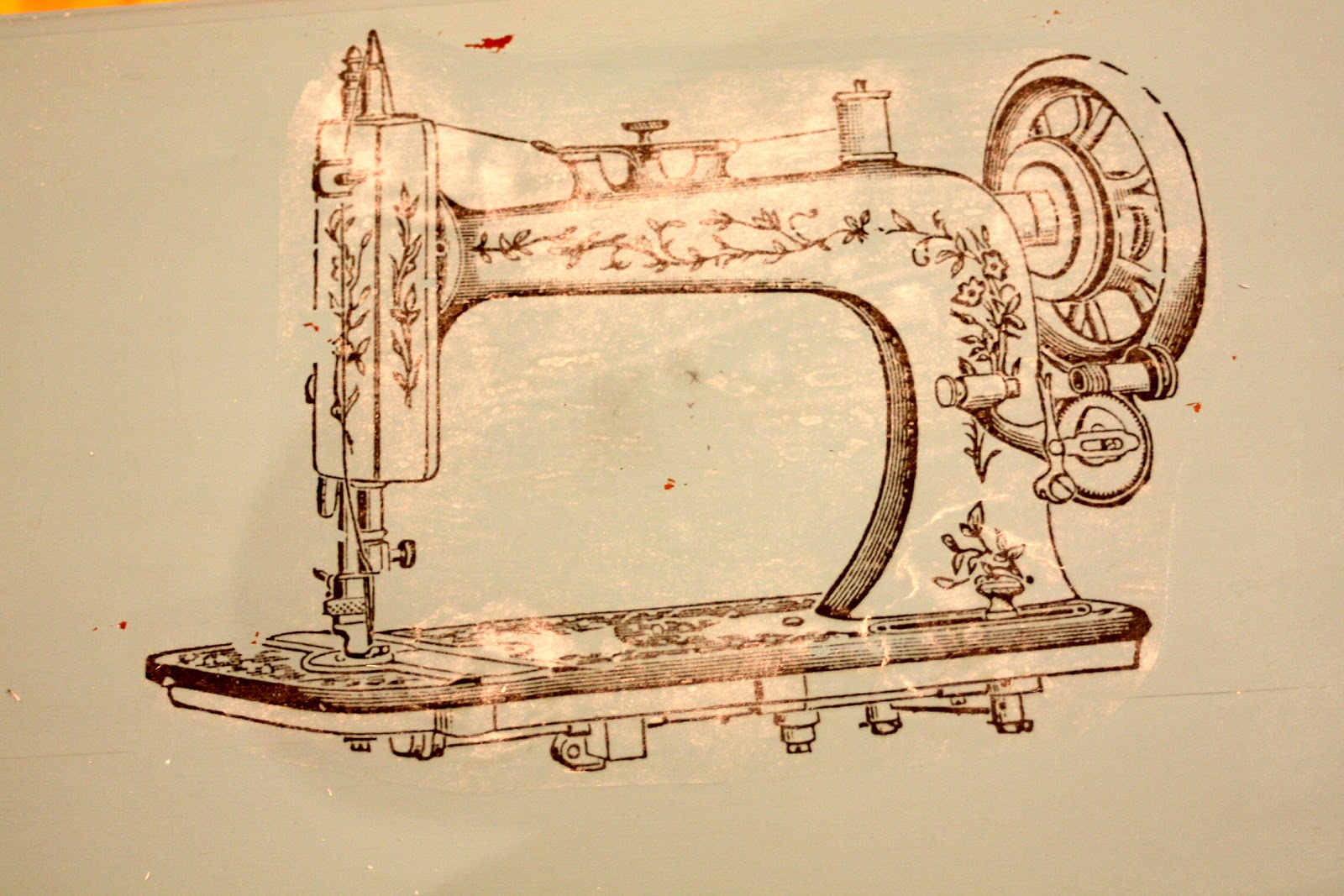
To transfer an image with AE gel, it needs to be printed with a laser jet printer. Don't forget to reverse the picture to a mirror image if it has words or it needs to go a certain way, like the sewing machine further down.
Apply the transfer gel to both the paper and to the object where you want your picture. Then, put the paper in place face down and smooth it out. Let dry overnight or for several hours. Then with a spray bottle filled with water, wet the paper and let sit for a few minutes. With a sponge or a cloth, rub the paper away.
I was lucky right off the bat with this picture. The transfer was nice and crisp! It seems to be easier to transfer on light or white paint, as it doesn't leave as much of a "halo", which is the gloss left behind by the transfer gel. You could see a little bit of a halo on this piece, so I brushed a bit of cream paint to cover it. Once dry, I applied clear wax.
It's a lovely little sewing cabinet to store all your sewing notions and supplies. I imagine it's somewhat old and it is in very good shape.
I painted it in Provence. I felt it needed a fun, happy colour. I found a lovely vintage sewing machine picture at the Graphics Fairy. So fitting, don't you think! I went through the same steps as for the plate to do the image transfer.
Well. Not so good this time. It left a lot of white gel as you can see. So I sanded it down and repainted it, then reapplied the image.
Three. Times.
Success! I finally was left with a nice, crisp image. Love it!
I left the inside of the top unpainted as it was in very good condition.
I painted the inside of the drawers in Aubusson Blue for a bit of unexpected contrast.
I'm sold on the AE transfer gel. It helps you achieve a nice, crisp and clear transfer. Just be patient with it. I just wished they had an online tutorial or more instructions on their website. As it is, I suspect this will come from the blogging community, as more and more people use it and experiment with it.
Have you tried Artisan Enhancements Transfer Gel? What was your experience with it?
Stay warm!
Nicole
" alt="DIY Show Off" style="border:none;" />
This is the second piece I applied a transfer to.
I acquired this cute piece at auction. It was in the same lot as a magnificent Art Deco vanity and bench.
 |
| The White Pear Tree |
 |
| The White Pear Tree |
 |
| The White Pear Tree |
 |
| The White Pear Tree |
 |
| The White Pear Tree |
 |
| The White Pear Tree |
You see, if you rub too hard, the image comes off too. And the paint.
Yes, I was frustrated at this point. But I am determined if nothing else. This was going to happen.
So I tried something different this time. I kept wetting the image, particularly the spots with the white goo, letting the water sit on it for a while and then rubbing gently. I did this several times. And this did the trick. The white goo slowly came off. This requires a little bit of patience, but stick with it.
 |
| The White Pear Tree |
 |
| The White Pear Tree |
 |
| The White Pear Tree |
 |
| The White Pear Tree |
 |
| The White Pear Tree |
I'm sold on the AE transfer gel. It helps you achieve a nice, crisp and clear transfer. Just be patient with it. I just wished they had an online tutorial or more instructions on their website. As it is, I suspect this will come from the blogging community, as more and more people use it and experiment with it.
Stay warm!
Nicole
*******
Linking up to:
http://suzyq-vintagous.blogspot.ca/2013/03/je-suis-un-linky-party-co-host.html

br>
br>
http://diyshowoff.com/category/other/that-diy-party/" title="DIY Show Off"> http://i899.photobucket.com/albums/ac195/Roeshel/thatdiyparty125button_zps360f71b1.jpg
Read more at http://diyshowoff.com/2013/03/24/that-diy-party-9/#AtIySZ7wIf2FZfRy.99